
How a Rummy App Listing Page Is Laid Out and What You Notice First

How a Rummy App Listing Page Is Laid Out and What You Notice First
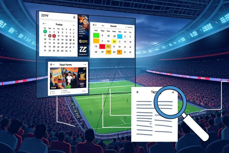
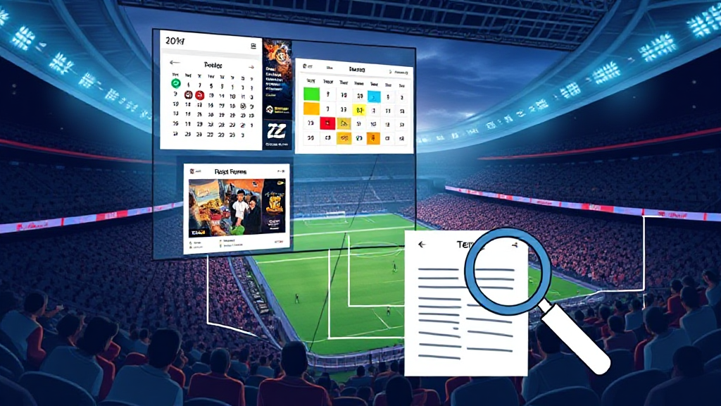
Nobody reads a rummy app listing page. They scan it. The eye moves in a predictable order — top-left to top-right, then down through the fold, then across the bonus block, then into the fine print — and the layout either cooperates with that pattern or fights it. Understanding how these pages are assembled tells you a great deal about what you are likely to miss, and what the page is quietly hoping you will notice before you tap anything. If you want to see the pattern in practice, AA GAME Online is a useful reference point because its pages are built around exactly this scanning rhythm.
This is a layout anatomy, not a strategy guide. It walks from the top of a typical listing page to the bottom, explaining what draws the eye at each stage and why the design choices were made that way.
The Header Band: Where the Eye Lands Before It Decides Anything
The first thing a reader registers is rarely a game name. It is the header band — the strip across the top that carries the app title, a category label, and usually a small badge indicating a bonus or an event window. This band exists to answer one question in under two seconds: is this page about the thing I came for?
Designers place the strongest contrast here. A bright badge, a bold title, a coloured ribbon. The eye is drawn to contrast before it is drawn to meaning, which is why the badge often outcompetes the actual app name for attention. On a well-built page, the badge is informative rather than decorative — it might read “Welcome Bonus” or “Event Ends Soon” — but the visual pull is the same either way.
A practical consequence: readers frequently remember the badge and forget the name. If you close the tab and try to recall what you saw, the coloured element is what survives. That is a layout effect, not a memory failure.
The Hero Panel: The Largest Element on the Page and Its Hidden Cost
Below the header sits the hero panel — usually a wide image or illustration with a headline overlaid. This is the largest single element on most listing pages, and size equals priority in visual hierarchy. Whatever sits in the hero gets read first, even when it is the least important thing on the page.
The hidden cost is vertical space. A tall hero pushes the actual listing — the game tiles, the bonus terms, the eligibility notes — below the fold. Readers who do not scroll never reach the information that matters most for a decision. This is why so many listing pages now use a compressed hero: a shorter image, a tighter headline, and an immediate transition into the content grid.
When you land on a page and feel like you are scrolling past decoration to reach substance, that is a hero panel doing its job badly. When the transition from hero to content feels almost immediate, the layout has been tuned for scanning rather than for spectacle.
The Bonus Block: Colour, Placement, and the Terms That Sit Below It
Roughly a third of the way down, most listing pages place the bonus block. This is the section that carries the welcome offer, the reward amount, and the button that leads to the opt-in. It is almost always the most colourful part of the page, and it is almost always the part readers describe when they try to explain what they saw.
The design logic is straightforward: bonuses are the primary motivator, so they get the primary visual weight. But the layout also reveals a hierarchy of its own. The reward amount is set in the largest type. The button is the second-largest. The terms — wagering requirements, eligibility rules, cash-out conditions — are set in the smallest type and placed below the button, sometimes in a collapsed panel.
This is not an accident. It reflects a deliberate ordering of attention: reward first, action second, conditions third. A reader who scans in the natural top-to-bottom order will absorb the amount and the button long before they reach the terms. If you want to read a listing page the way its designer expects, you have to consciously reverse that order — terms first, then the offer.
Pages that handle this well often pull a short summary of the wagering requirement up beside the reward amount, so the two are read together. That single layout choice changes what a reader notices first, and it is one of the clearest signals of whether a page is built for clarity or for conversion alone.
The Game Grid: Tiles, Labels, and the Scan Pattern That Skips Half of Them
Below the bonus block comes the grid — rows of game tiles, each with a thumbnail, a name, and sometimes a small tag indicating stakes or variants. This is where the eye moves fastest and remembers least.
Grid scanning follows a rough Z pattern: across the first row, down the left edge, across the second row. Tiles in the top-left and top-right corners get the most attention. Tiles in the middle of the grid get the least. If a page has twenty tiles, most readers will consciously register four or five and merely acknowledge the rest.
Designers exploit this by placing promoted variants in the corners — the newest game, the highest-traffic table, the one tied to a current event. The middle of the grid becomes the archive. Nothing is hidden, but not everything is seen, and the layout decides which is which.
One useful habit when scanning a grid: read the tags before the names. Tags are short, consistent, and comparable across tiles. Names are longer and harder to hold in working memory. The tag row is where the actual comparison happens, even though the thumbnail is what the eye notices first.
The Eligibility and Event Window Strip: The Section Most Readers Skip
Further down, often just above the footer, sits a narrow strip covering eligibility and event windows. It typically states the minimum age, the regions included, and the dates during which the offer runs. It is visually quiet — small type, muted colour, no buttons — and it is the section most readers skip entirely.
The layout reason is contrast. Everything above this strip is designed to attract; this strip is designed not to intrude. Low contrast reads as low priority to a scanning eye, even when the content is the most consequential on the page. A missed event window or an unmet eligibility condition can invalidate everything above it, yet the design gives it the least visual weight.
This is the single biggest mismatch between layout and importance on most listing pages. The fix, when a page bothers to apply one, is a small icon or a coloured left border that lifts the strip just enough to register without competing with the bonus block. When you see that, the page is signalling that it wants you to read the conditions — and that is worth noticing.
The Footer and the Cash-Out Terms Link: Where the Real Detail Lives
At the very bottom, the footer carries the links that most readers never click: cash-out terms, responsible gaming notes, full terms and conditions. These are placed last because they are reference material, not decision material — but they are also placed last because placing them last reduces the chance they will be read before the opt-in.
The layout logic here is consistent across almost every listing page. The further down the page, the smaller the type, the lower the contrast, and the more likely the content is to be a link rather than text. If you want to evaluate a page properly, start at the footer and work upward. You will encounter the conditions before the persuasion, which is the reverse of the designed reading order and usually the more useful one.
None of this makes listing pages deceptive by default. It makes them ordered. Visual hierarchy is a tool, and like any tool it can be pointed at clarity or at speed. The reader who understands the order can choose which one they are getting.
FAQ
Why do I remember the bonus amount but not the wagering requirement?
Because the bonus amount is set in larger type, in a higher-contrast block, and placed above the terms. The eye registers size and contrast before it registers meaning, so the largest element sticks and the smallest one does not. Reading the terms first, before the offer, reverses that effect.
What part of a listing page should I read first?
The eligibility and event window strip, followed by the cash-out terms link in the footer. Both are placed low on the page and set in small type, which means they are usually the last things seen and the first things that should be checked.
Does the position of a game tile mean anything?
Often, yes. Tiles in the top corners of a grid receive the most attention, so promoted or current-event games tend to be placed there. The middle of the grid functions as an archive — visible, but rarely scanned closely.
Why is the hero image so large if it is not the most important content?
Because size signals priority in visual hierarchy, and the hero is designed to establish context quickly. The trade-off is vertical space: a tall hero pushes the substantive content below the fold, which is why many pages now use a compressed version.
Is a page with a small terms section trying to hide something?
Not necessarily. Low-contrast terms are a near-universal layout convention on listing pages, driven by the assumption that conditions are reference material rather than decision material. The convention is worth knowing about, because it means the information you most need is the information the layout least encourages you to read.